
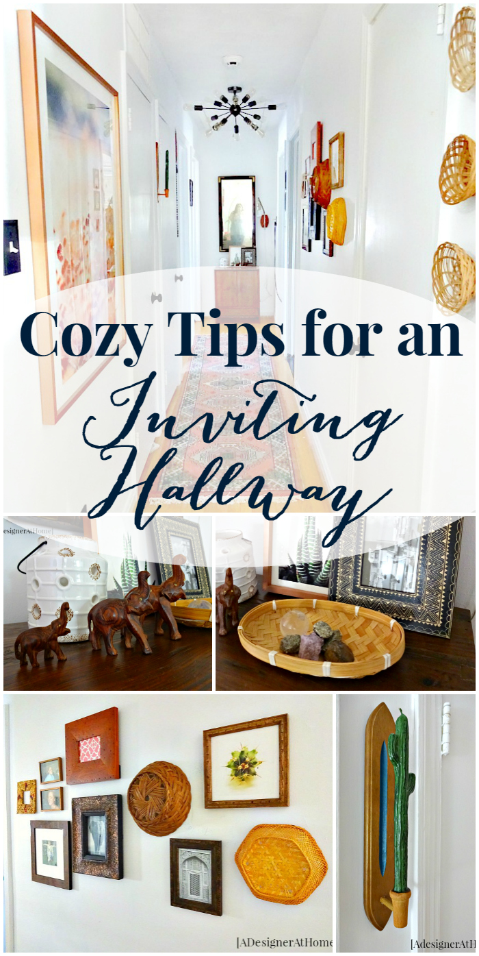
As part of a New Year kick to the butt, I took on refreshing our hallway to inspire me (and you?) to give our homes the attention it deserves. To recap, we basically started off with a stark and dark space. It was cold, it was ugly and there wasn’t adequate light. A summary of our goals for the space is that we want it to be light, bright, cozy and homey. My design plan includes my favorite theme for a space- Vintage Bohemian. So let’s dive into what changes we made towards this goal and maybe you’ll find a few things you can do to make your hallway more inviting.
The first thing we did was paint the walls plain white. I mentioned early on that we cheated and had already done this. There were a few touch ups that needed to be made so I did those. The doors and trim are all pretty old and aren’t in the best shape. Since we’re simply doing a refresh, I plan on going back in and giving these all a good scrub (or waiting until we can afford to redo the trim ;))
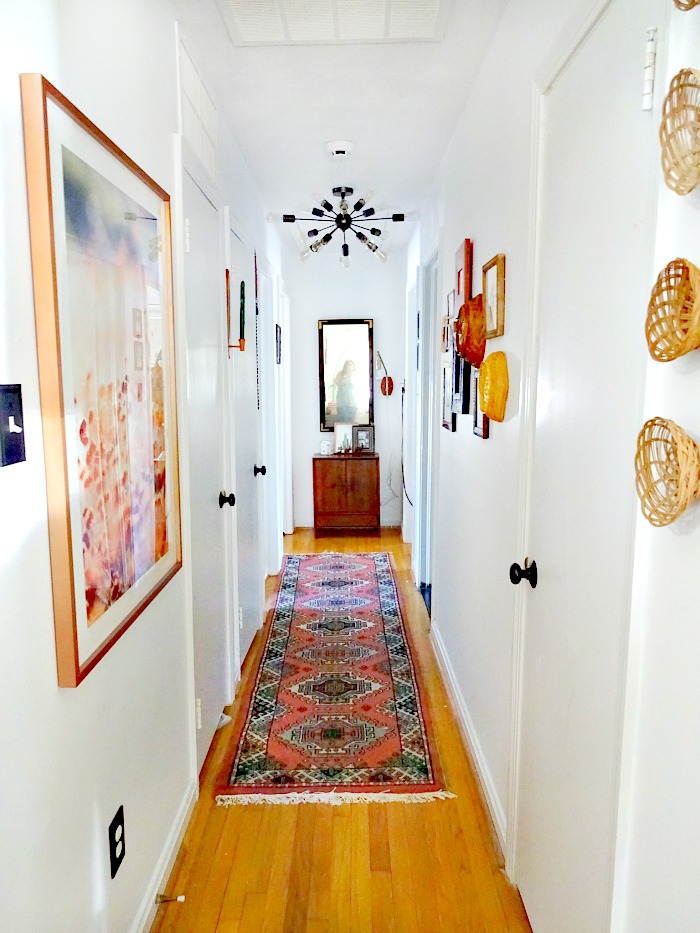
You’ll also notice that I changed the color of our doorknobs. I think this does a lot for the overall bungalow cottage vibe we want for the home and compliments a bohemian vibe well. It’s a classic so it doesn’t warrant a tutorial. I simply removed the handles, spray painted with Rustoleum’s oil rubbed bronze, let dry and reinstalled them. The paint was sensitive the first couple of days, so if you can hold off on putting them back on, that would be best in my experience.
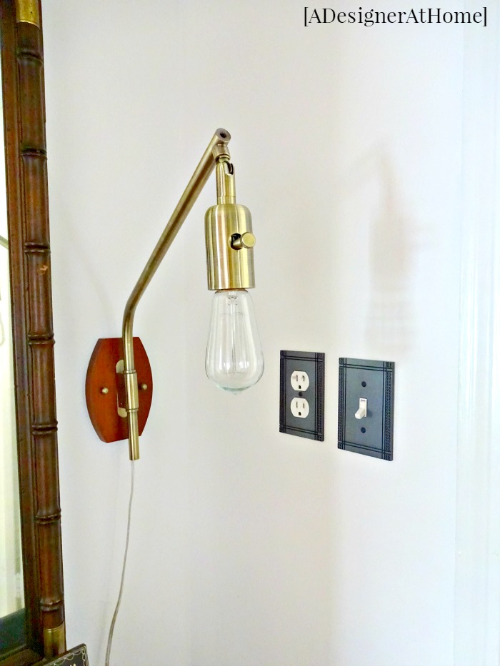
Another small hardware change was the plate covers. Hallways can have a lot of these for outlets and light switches. Because we normally can’t squeeze in as much furniture, they’re harder to cover up. So I sourced out (and looked at dozens upon dozens of options) and settled on ones that gave me a mission style kind of vibe (these ones if you’re curious). For me, I’m aiming for a cottage bungalow feel so these suite the style pretty good and are easier on the budget than “authentics.”
The number one question I receive about this space is, “where is the rug from?!” And I’m going to tell you it’s from ecarpetgallery on eBay. I really ought to dedicate an entire post to this rug but in a nutshell, it’s a one of a kind. I got it for $95 because I bought multiple items that triggered an automatic 10% off. It’s beautiful, thick, and I do plan on going back to them for rugs in the future.
I know a rug can do a lot for any space. Warm colors, a fun pattern, and cushion underfoot really help solidify this as a “space” instead of the tunnel to other rooms. By making sure a rug is in place, it visually layers the space. And you must know I love layers for a lived in look.
If there’s room to squeeze in any furniture, a cabinet or even a small (but tall) plant stand, it makes the space feel more like a room simply because that’s what we see in a room. Utilize all the space. I like warm wood tones for adding warmth and that “cozy factor” to every space I work with.
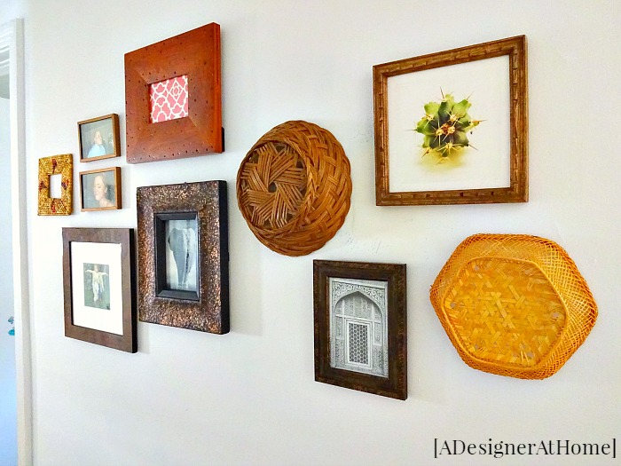
I really went all out with the artwork. It did eat up a ton of our budget, but there are other ways of getting large scale art for much cheaper. Varying sizes of artwork, different textures for wall decor, and globally inspired frames help tell the same story the rest of my home tells. By being so cohesive with the other rooms around it, they all feel like expansions of one another versus closed off spaces.
So if you’re struggling with making your hallway an enjoyable space, try switching out or spray painting the hardware to fit your style, paint the walls a brighter color, choose a rug that is both comfortable and beautiful, squeeze in a piece or two of furniture and coordinate the artwork with adjoining rooms. You’ll be on your way to a beautiful space you enjoy strolling through instead of dashing through.

Great hallway that truly does look inviting. Visiting from Link Party Palooza.
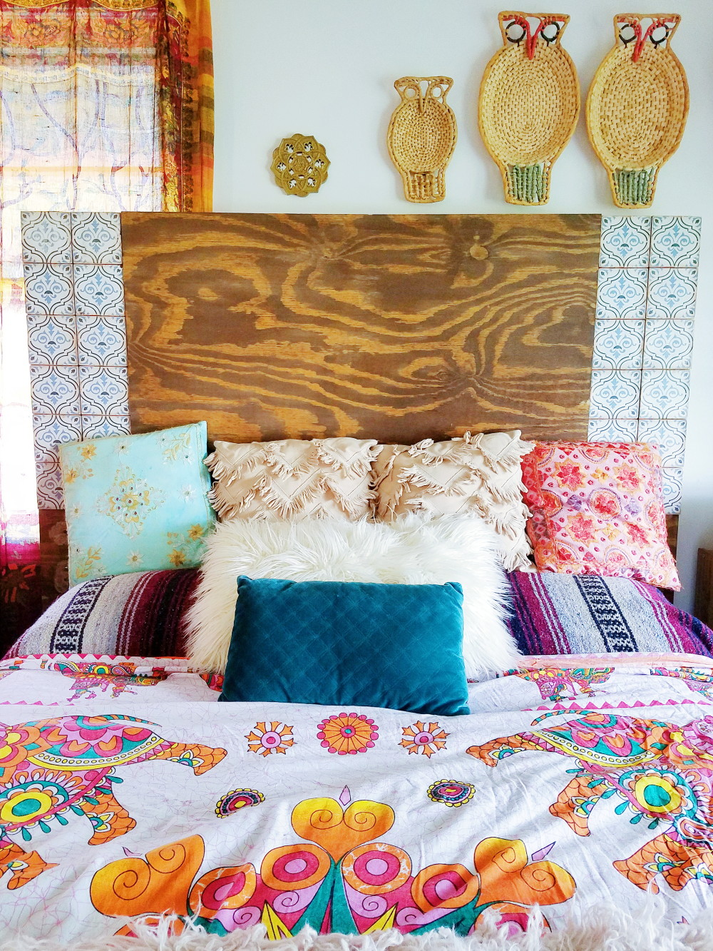
I love the idea of those baskets on the wall! What a creative gallery wall addition. Stopping by from Link Party Palooza – thanks for sharing!