
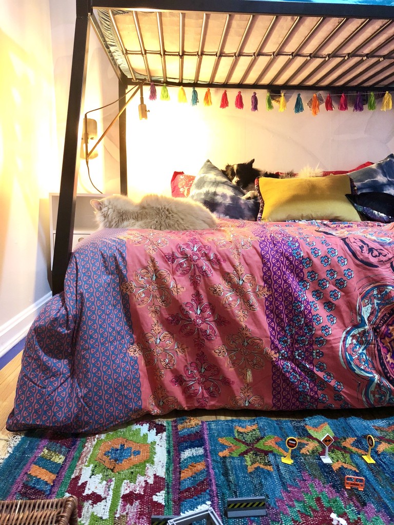
Bunk beds aren’t really the most aesthetically pleasing piece of furniture. Try as you may, even the most designer of bunk beds still feel like a bulky, unattractive piece of furniture. If you’re going to have one, I think ought to treat it as if it were a daybed. Here’s how I’ve made a bunk bed the focal point of my kids room makeover:
- Center it
- Flank with matching nightstands
- Use swing arm lighting for task lighting
- Dress the pillows like a sofa
- Choose bedding with high style
- Accent the wall behind it
I think the number one thing you should do when working with a bunk bed or daybed it to center it on a wall. It makes it feel much less bulky and awkward. Even on a wall as small in a room as small as this one, it opens up the space more when the air around the bed drifts away from it on both sides. Especially with white walls and ceilings the illusion is greater.
Bringing in matching nightstands makes things feel less cluttered and adds balance. It also draws the eye down the the bottom level of the bunk bed, adding to the cozy sofa look.
I like swing arm lights for the bottom bunk because you can swing them in under the top bunk and it creates a cave-like reading nook. They can be swung out from the sleeping area at night but swung into it for task lighting.
Instead of making the furniture feel lopsided with a visually heavy left or right side, to for balance by dressing the bed like a sofa. Line up the pillows along the long side against the wall. When you line up the pillows at a “head” of the bed, it makes one side appear visually heavy. Definitely don’t want that with an already large piece of Furniture.
Textiles are already a huge part of a bedroom design and with a bunk bed, you want to really outshine the aesthetic of the furniture itself with bedding that really brings the theme of the style out loud. Boho is our aesthetic so we went with a very colorful and bright comforter set with a bohemian Asian and Indian inspired design.
And then to really draw the eye into this part of the space, I put up the Anewall bird paradise peel and stick wall mural as a soft jungalicious backdrop. You could use a mural or paint/stencil a design or color.
Curious how this past week went? Here’s the blog. I did get a new phone mid vlog clips so the quality may go off. Let me know if you like the beginning footage (Samsung s7 edge) or the end (iPhone 8 plus) better!
The reveal for this space is coming next Tuesday for me. With all the snow, shipping delays just threw everything off schedule so we are taking just 1 more week to play catch up on remaining painting, plant hanging, dresser decorating and wall art hanging.

Casa Watkins Living // A Designer At Home // Seeking Lavender Lane // Domicile 37 // Iris Nacole // Pocketful Of Posies // Monica Wants It // Up To Date Interiors // This Is Our Bliss // Vintage Romance Style
Be sure to link up your own room refreshes below! Need an extra week like some of us? We will have this link up next week too! Stay tuned for more room reveals next week!
Please remember to ONLY link up posts related to the New Year, New Room Refresh Challenge below.
“
I hear you on the bunk beds, but the bright colors are lovely!!!
look forwrad to seeing the reveal next week.
I love the idea of treating it like a daybed or sofa! And what beautiful, bold colors! You’re totally going to rock this reveal next week!
I did the same thing with my daughter’s bed, treating it as a day bed. Can’t wait to see the reveal!