
Hey Guys!
If you hadn’t already seen, the 6 week One Room Challenge ended last week. And how did I celebrate failing? I visited every single entry linked up. And while I do totally think you should take the time to visit every single entry, too, I also wanted to highlight and share my favorites because there’s just seriously great talent out there- seriously.
So let’s dive into my favorite 6 week room transformations:
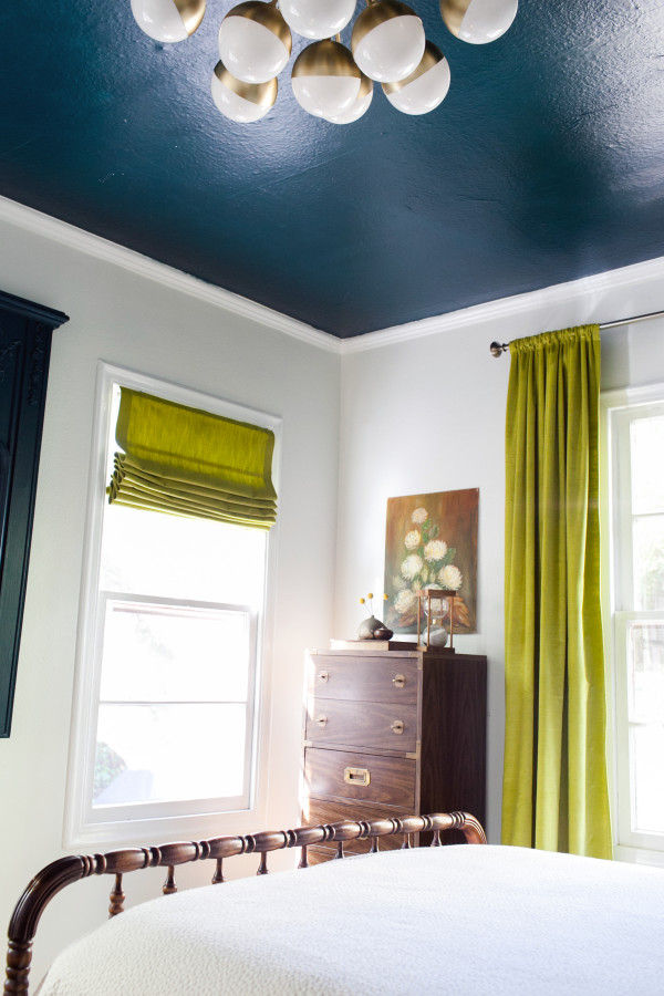
Claire Brody Designs | Guest Room: The highlight of this space for me the ceiling. Not only an amazing color, but also such an interesting way of incorporating a paint color into a space. That, the light fixture, the furniture and the styling made this space an immediate win for me.
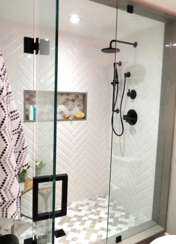
Bedford & Bloom | Bathroom: I am not only floored that this space was completed in the 6 week timeframe (I did, after all, also tackle a bathroom and failed ridiculously), but I love the black on white on grey. It’s a sophisticated and rather timeless combination. Plus, those beveled subway tiles are a lot like the ones I’ve already drooled over before so it’s a no brainer- I love this space.
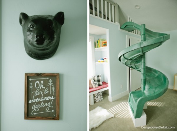
Design Loves Detail | Kid’s Space: This playroom is ridiculously cute. The highlight of the space is, of course, the slide- like how cool is that? But, there’s also so many other fun details to the space, too. The camp lodge theme is themey, but in the classiest way I could imagine with an RV play tent and plush campfire set.
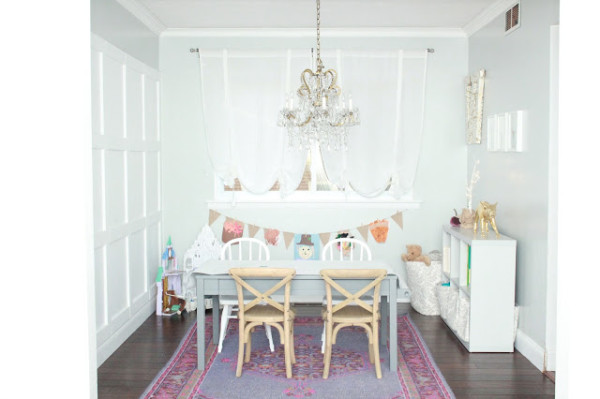
Olde Town Style | Playroom: The chandelier makes this space. Such a glamorous space, but yet it looks like so much fun to be in. And it shows you how you don’t have to have a giant play space to have a functional and pretty space. It’s truly pretty and admiration inducing. Being that I do have a girly bone in my body, I had to include this beautifully designed space.
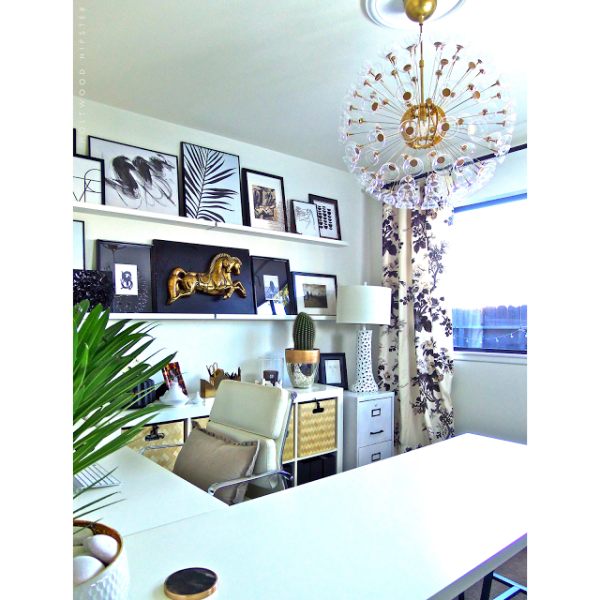
Holtwood Hipster | Home Office: I am not by nature a minimalist kind of person (it sortof goes against every boho bone in my body), but check this epic office out. The black and white are, again, classic and timeless, but I love how it’s broken up with all the coordinating art and the warmth of the gold. I can sense the creativity flowing in this space.
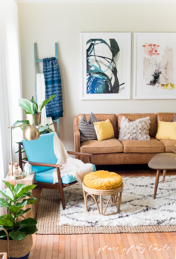
Place Of My Taste | Living Room: Aniko practically stole my vision for a living room. I kid, but I do very much adore every element she brought into the space and I’ve been eyeing down that sofa for ages. The pops of color are the highlight of this space. They coordinate so well and bring an energy to the space.
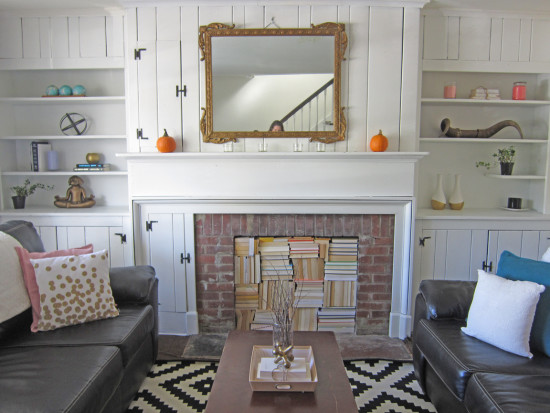
The Honeycomb Home | Living Room: There are few times I wish I were a college kid with a designer for a mom, and a space like this is one of those few times. Simple changes and a few great ideas created such a cool hangout spot. My favorite takeaway of the space in the fireplace filled with books. That is the coolest fireplace filler idea I’ve seen.
Jesse Coulter | Twin Nursery: These babies are going to be growing up in the coolest baby room I’ve personally ever seen (in real life of photo). All of the vintage pieces, that insane rug, and the super fun pom pom garland speak to me on a spiritual level. If I were to ever have another child, this is what I’d aim for.
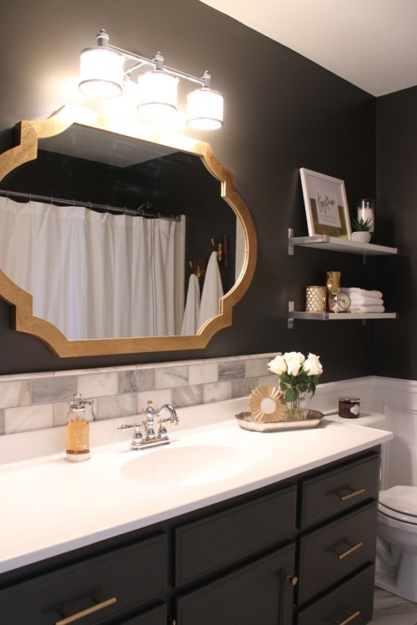
Inspiring Hearts and Homes | Master Bedroom: When someone just kicks butt at a bathroom remodel, you just have to take a moment to give them kudos. This bathroom is beautiful and all of the elements coordinate, but the thing I wanted to especially bring notice to is the tile around the sink’s splashguard. That’s essentially what I had planned on doing with that really cool patterned tile I picked up.
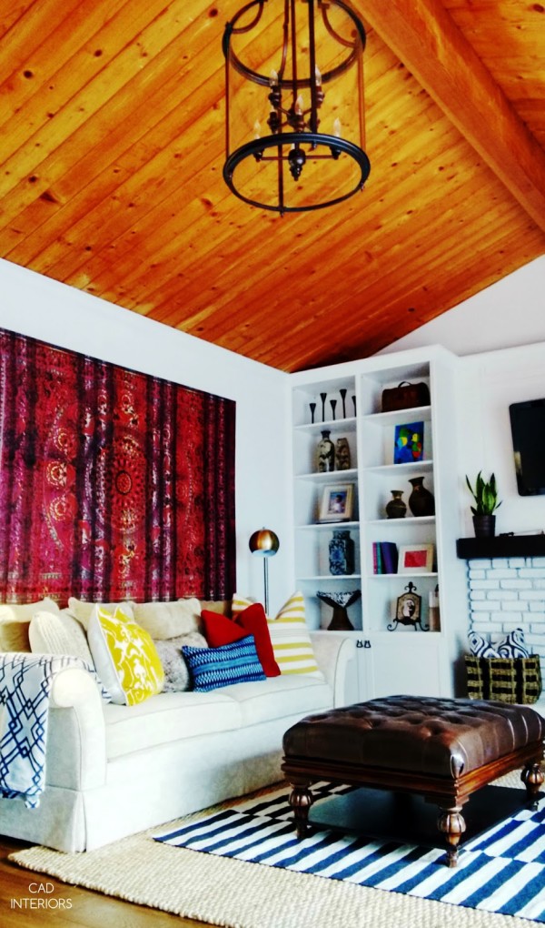
CAD Interiors | Family Room: Oh lawd, that tapestry gives me tingles. It’s just all sorts of boho goodness. Looking past the obvious stunner of the space, The planked ceiling is dreamy and those builtins are beautiful. So many interesting architectural elements and they’ve been styled to really let them shine.
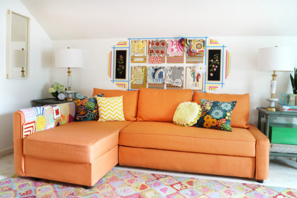
Maggie Overby Studios | Studio/Sewing Room: Maggie is a thrifting prodigy, she’s even cohosted #thriftscorethursday with us. So it’s no surprise the space she shared for ORC was decked out with interesting and beautiful thrifted treasures. The striking use of color in the space is energizing and I bet motivating for sewing and crafting (good since that’s what the space is intended for anyways!).
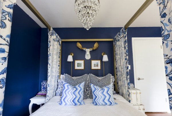
There’s No Place Like Home MKE | Bedroom: The stunning use of pattern on pattern in one of my favorite colors immediately drew me into this space. The glamorous pieces like the chandelier paired with fun zigzag and moosehead make this space so interesting and fun. I also saw this style bed pop up a ton in ORC and am crushing like mad on it.
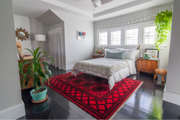
White Dog Vintage | Master Bedroom: Brittany has an incredible eye for vintage goods, but she’s also phenomenal at decorating spaces. Have you seen her kitchen? This space does not disappoint- look at that rug! It’s the showstopper of the space but then the eye starts to wander and you see that every piece is meticulously coordinated and stunning.
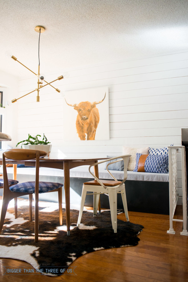
Bigger Than The Three Of Us | Eat In Kitchen: That light fixture is cool, isn’t it? There’s, again, so much to love about this space. There’s a relaxing but interesting vibe going on about the space and I think a lot of that has to do with the careful use of color. That painting is an original, but you’ll have to visit the reveal for all those details.
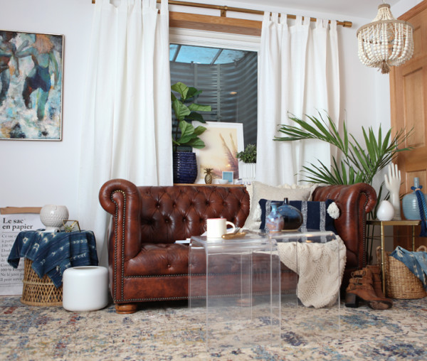
House Of Hipsters | Office: I’m a quick fan to a space that utilizes vintage treasures and Kyla is an easy stop for vintage goodness. This office is the stuff my dreams are made of. I would be happy to curl up on that sofa and watch her work all day. And probably peruse all the trinkets styled throughout the space endlessly. The highlight for me? It’s a toss up between the pink chair and the beaded pendant light.
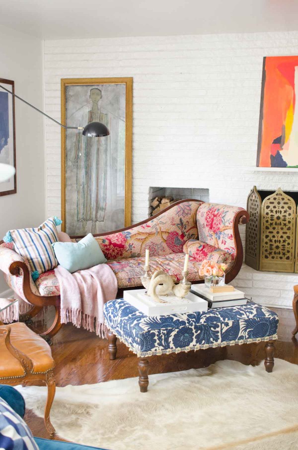
Thou Swell | Living Room: The classic pieces in this living room pair seamlessly with the modern pieces. There’s a lot to love about this space, too, but I’m drawn in by the silliest of things sometimes. Once I got past the beautiful use of pattern, I rested on that beautiful wall of brick, and that fireplace screen! Dreamy.
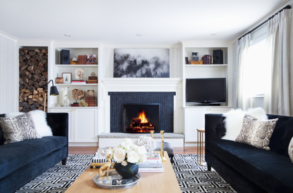
The Curated House | Living Room: Navy, patterns and beautifully styled shelves? I had to slip this one in. The moody artwork above the fireplace, and that fireplace’s tile are the showstoppers for me, but there’s a lot to like about this space (there’s a dreamy office space you just have to check out).
To summarize: My favorite elements I saw repeated over and over were the use of navy, artwork, vintage finds, gold and contrast. Everyone did an incredible job with the ORC and I love all of the hardwork and interesting design choices. I’ll be participating next Spring again and I’ll definitely be taking noted from these fabulous spaces.


You picked out most of my favorites! I adored Britt’s bedroom, The Curated House living room and that amazing (jaw dropping) playroom. Probably, my most favorite transformation was the CAD Interiors Family room. I really adore the vibe in that space.
Thanks for including my eat-in kitchen in your round-up.
Now, get busy on yours… I want to see it! xoxo.
Thanks Corinna for the kind words on my Navy guest room makeover! you are so thoughtful!
There were a few of these I missed last week, that boho living room from A Place of My Taste is awesome! Thanks for including mine!
Awesome choices and thank you for your kind words about my project!
Aww, what a nice surprise! Thanks for featuring the room on your blog, and for the kind words. I’m still making my way through all the rooms… The ones you featured are awesome! 🙂
Girl, you did your homework–this is a fantastic round-up! I had missed some of these, so I’m glad you brought them to my attention. Thank you so much for including my bedroom! This is wonderful company to be in. I can’t wait to see your bathroom when you finish it up!
Great roundup of the ORC. I really love Claire Brody’s style and her room. Love all of your choices.
Thank you so much for including my project in this roundup – I’m flattered to be in such great company! ORC is so fun, I can’t wait to see your spring project!