Tuesday was reveal day for my and 12 other stylists, designers, and enthusiasts to share a space we’d been working on refreshing for the previous 3 weeks. There’s a plethora of styles and rooms of the house that have been refreshed so I wanted break down exactly what projects you can use to make a refreshing impact in your home. Most of these are projects you can start and finish in a single weekend. What’s better than that?
Ideas For Refreshing Every Space Of Your Home

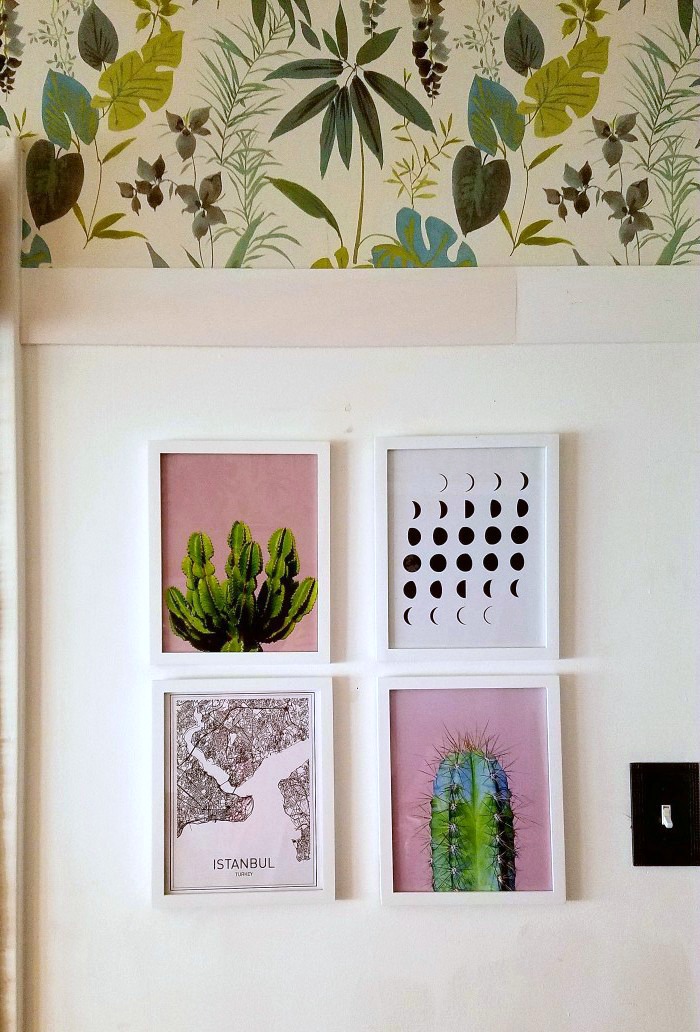
I chose these 4 prints for the barren piece of wall. They tie in the pink and green theme of the rest of the space. I’m also infatuated with the night sky and the culture, architecture and textiles of Turkey. You can find these and more prints here.
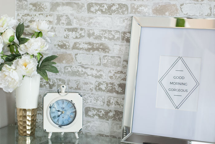
For the bedroom, or even a bathroom, this “Good Morning Gorgeous” print is available for download and print here courtesy of Vintage Romance Style. There’s even a coordinating “Hello Handsome” should your household roll that way 🙂

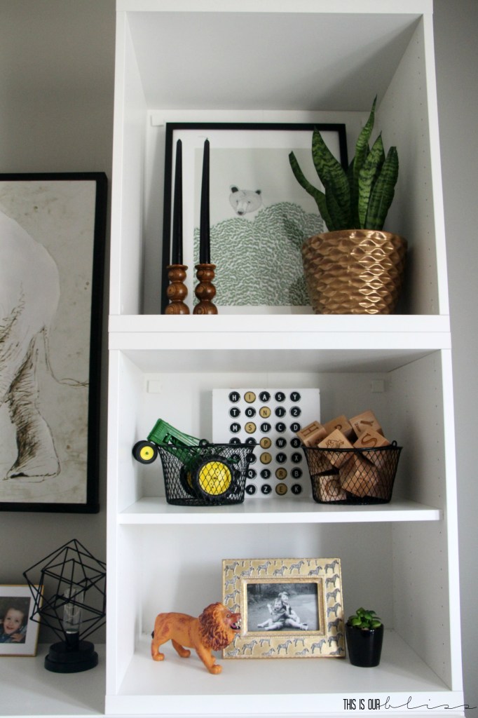
Even a kid’s space can get a chic, interesting update with some shelfie styling that incorporates the style of the rest of the home with playful, children’s touches. There’s more shelfie goodness here on This Is Our Bliss.
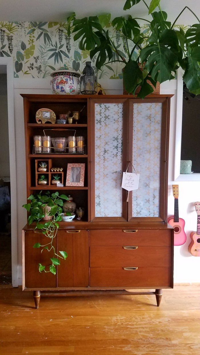
The shelves of a classic mid century piece of furniture can enhance the other styles of a space by choosing frames and displaying collections that match the style of the rest of the home. Even if you’re stuck with piece of furniture you don’t find to be “your style,” it can be the perfect spot to display things that are. In my case, I love mixing in midcentury, but hopefully you get the point 😉

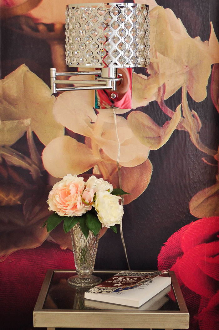
Lighting doesn’t have to be a massive impact in a space. But updating older fixtures and ones that don’t match the rest of the room can bring a sense of completeness that you’ll feel in the every day. For a bold, chic, glam space, size appropriate crystal sconces flanking a bed are the perfect touch. There are more glam, bold and chic ideas here on Monica Wants It.
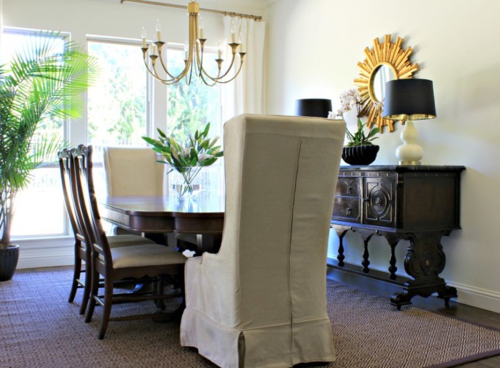
With so many dark pieces, it really brightens up a room to bring in an elegant brushed golden hued fixture. It’s the most visually heavy piece in the space, but that’s a good thing. Well designed rooms have balance. More of this space can be seen here on Sharon Joyce Interiors.

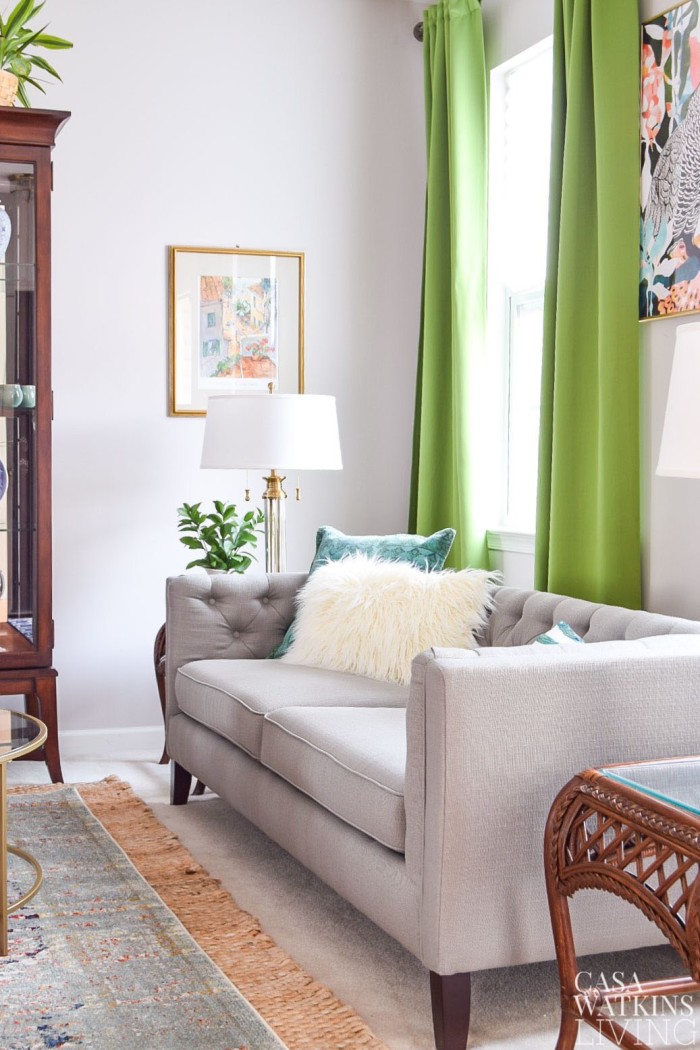
A tired looking space can be completely rejuvenated by replacing just one piece of furniture. It doesn’t have to be the worst worn piece and it doesn’t have to be the largest piece. Naturally either of those will have the biggest impact like this sofa did for Casa Watkins Living space that you can see more of here.
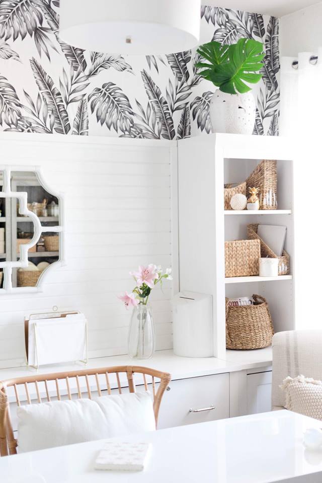
The piece that really drives home a tropical feel in this space is the rattan chair. There’s nods to the style throughout the space, but changing out a traditional office chair for this rattan one was the perfect move. Get more ideas for refreshing an office space here courtesy of Iris Nacole.

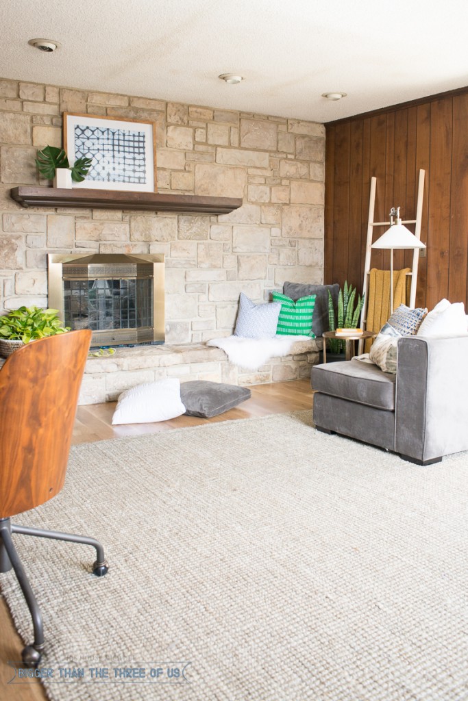
For a perfect example of what simply purging does, this space from Bigger Than The Three Of Us shows exactly what impact that has. No paint, no fancy lighting, no extensive gallery wall to distract you from what is missing. The space is beautiful and functional and that’s what matters.

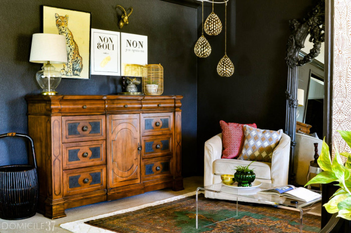
You’ll never match the dramatic power of painting an entire space a deep hue. If you’re after drama, just do it. In fact, if you’re craving impact but are loving everything about your space, paint is probably the way to go. See more of this dramatic space here on Domicile 37.
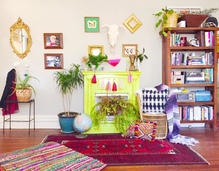
If you can’t paint your walls or just don’t want to or they’re already a perfect hue, paint something else for impact! This neon yellow color speaks a loud happy vibe into this space alongside every other color of the rainbow. For more of this colorful boho space, visit The Thrifty Hippie on Instagram here.

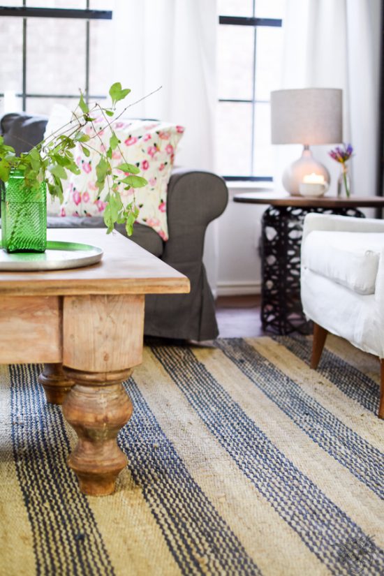
Replacing your existing rug (or adding one if you don’t already have one) is like replacing sheets on a bed. The impact can be as loud as you want but it’s still refreshing on a soul cleansing level. See more of the impact this rug made in Pocket Of Posies space here.

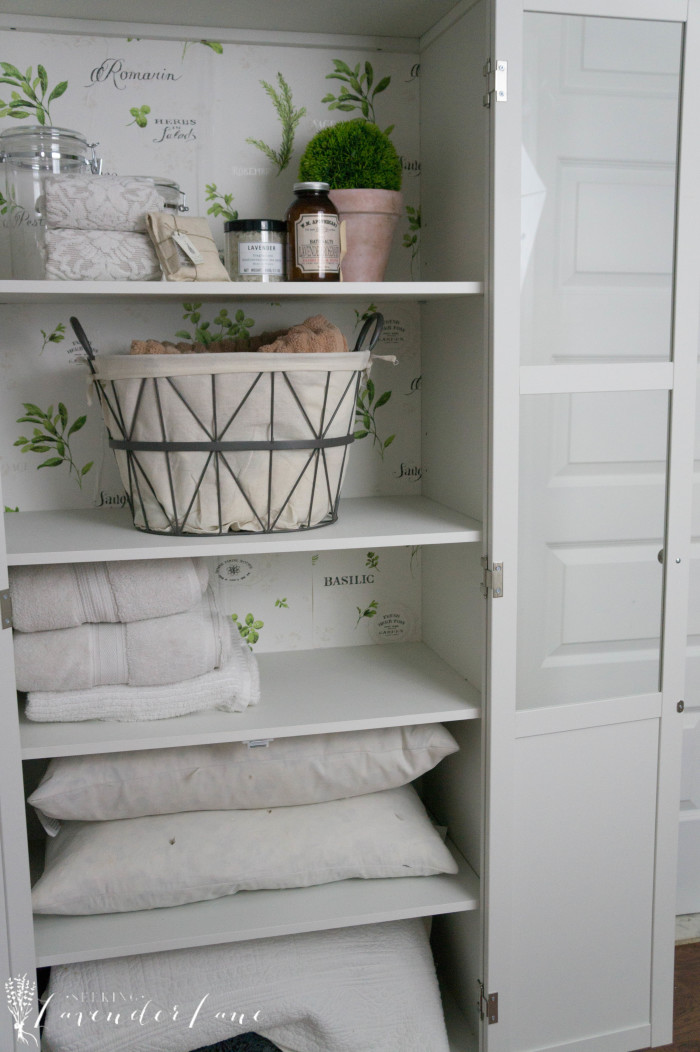
Using wallpaper in a small place like the back of a cabinet is a small touch but it’ll bring a refreshing touch to the everyday activities involved with using that cabinet. Even small details have an impact in the spaces we bring them to. For more small and big changes made to Seeking Lavender Lane’s spaces, visit the reveal here.
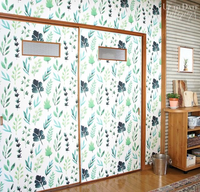
Once a space that was lacking in the impactfully, mood enhancing touches that can always be found in Up To Date Interior’s home, wallpaper brought a cool modern change to the space. The botanical print is on trend and matches the wood tones in the space perfectly. Click here for more of this japanese apartment refresh.

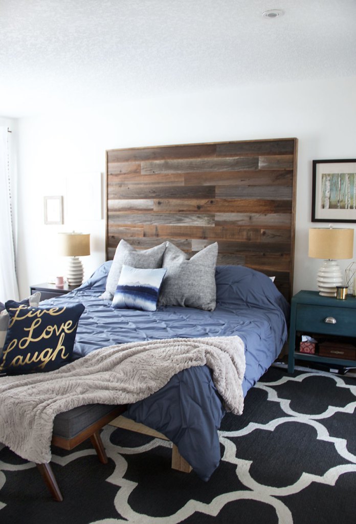
There are so many innovations with wood and faux wood products nowadays that building a focal piece is easier than ever. For the tutorial on this headboard, click here to visit Fresh Crush.
For more room refreshing inspiration, visit these 13 room refresh reveals:
Casa Watkins Living // A Designer At Home // Bigger Than The Three Of Us // Domicile 37 // Fresh Crush // Iris Nacole // Monica Wants It // Pocketful of Posies // Seeking Lavender Lane // Sharon Joyce Interiors // This Is Our Bliss // Up To Date Interiors // Vintage Romance Style
Don’t forget that you can tag your spaces with #newyearnewroomchallenge to be featured by the 13 bloggers linked above.
We’re still pretty early on in the new year, are there any spaces you’re hoping to make over this year?
